
A form can look perfectly reasonable and still be surprisingly difficult to complete with a keyboard, screen reader, magnification, voice input, or cognitive support tools. That is why form accessibility cannot be reduced to one question: “Does every field have a label?”
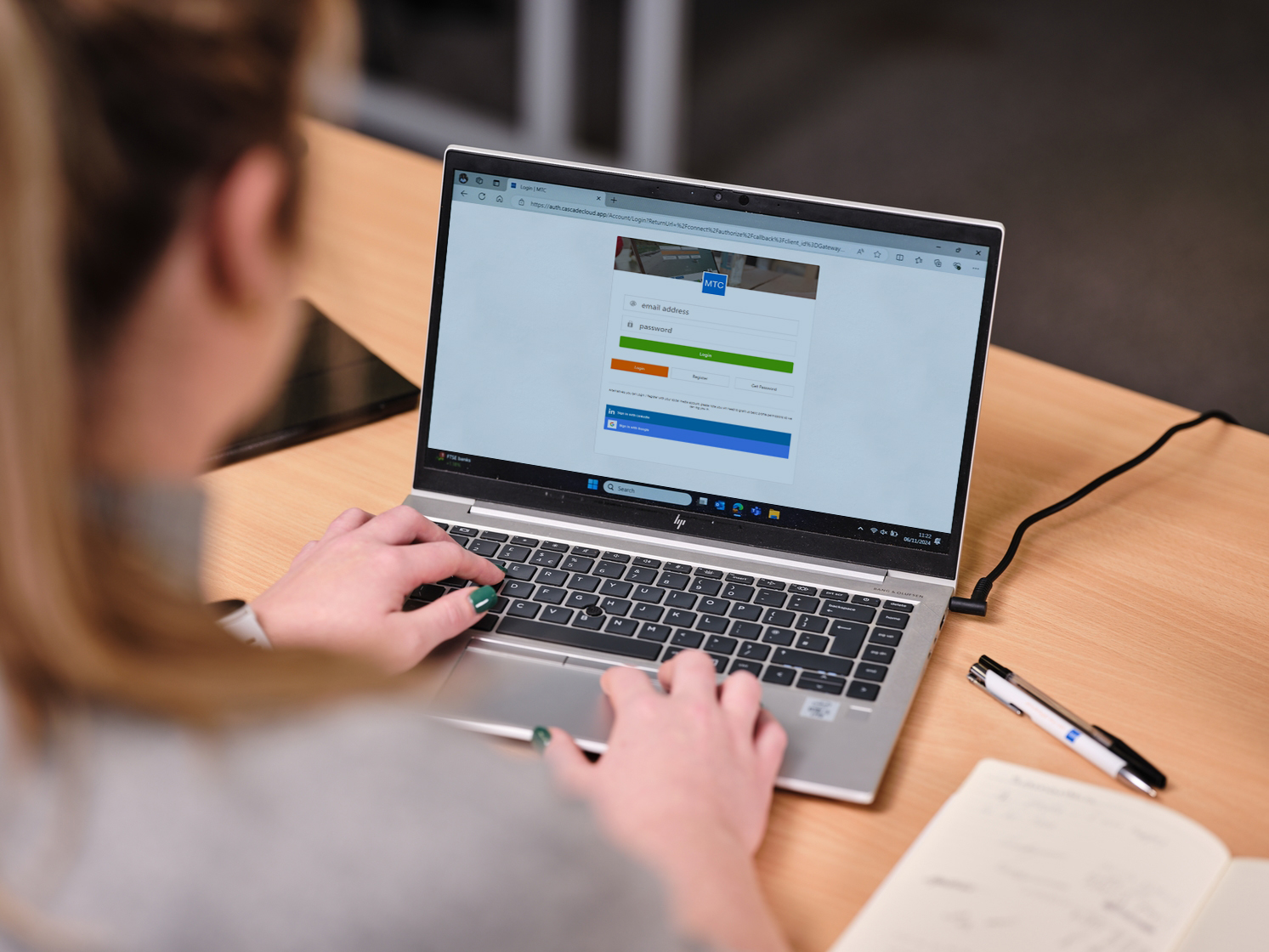
Labels matter, but a usable form is a sequence of interactions. People need to understand what is being requested, move through controls in a predictable order, recover from mistakes, receive useful feedback, and finish without unnecessary memory or re-entry burdens.
Automated tools can identify many useful signals, including some missing labels, invalid attributes, and common markup problems. But they cannot reliably judge the full experience of completing a form. That is where manual accessibility testing becomes important.
8 Form Accessibility Problems Automated Scanners Often Miss
1. A Placeholder Is Doing the Job of a Real Label
Placeholder text is often treated as a visual shortcut: put “Email address” inside the field and remove the visible label. The problem is that placeholders disappear as users type, can have low contrast, and may not provide the same persistent context as a properly associated label.
A stronger pattern keeps a visible label outside the control and uses placeholder text only when it adds optional guidance. The programmatic relationship between the label and the form control should also be correct so assistive technologies can expose the field name reliably.
The practical test is simple: once a user has typed something into the field, can they still tell what the field is for without guessing?
2. The form reports an error, but the user cannot find it
Error handling is one of the clearest examples of the gap between technically present information and usable information. A message such as “Please correct the highlighted fields” may be visible, but it is not very helpful to someone who cannot visually scan the page.
WCAG includes requirements around error identification, labels or instructions, and error suggestions. A useful error experience normally identifies the specific field, explains what went wrong in text, and gives the user enough information to fix the problem. Color can support the message, but it should not carry the meaning by itself.
For longer forms, teams should also test what happens after submission. Does focus stay at the submit button? Move to a useful error summary? Move directly to the first invalid field? The correct implementation depends on the form, but the user should not be left wondering whether anything happened.
3. The visible focus indicator disappears at exactly the wrong moment
Keyboard users depend on focus to understand where they are. A form may technically accept keyboard input while still being difficult to operate because the focus indicator is faint, inconsistent, clipped, or hidden behind a sticky header or modal layer.
This becomes especially important in complex forms with date pickers, custom dropdowns, inline validation, dialogs, and multi-step flows. A visible focus ring that works on ordinary text inputs can disappear when the same component enters an error state or opens a nested control.
Testing should include the entire workflow with a keyboard, not just tabbing through the first few fields.
4. A disabled submit button hides the path forward
Disabling the submit button until every field is valid can seem tidy, but it often creates a usability trap. A user reaches the end of the form, the primary action is unavailable, and the interface does not clearly explain what still needs attention.
A better experience makes missing or invalid information discoverable. That might mean clear inline validation, an error summary, or allowing submission and then directing the user to the fields that need correction. The goal is not to prescribe one universal pattern; it is to ensure that users can understand what is blocking completion.
This is exactly the kind of interaction problem that needs human review because the accessibility question is not merely whether the button has a name. It is whether the form communicates a workable next step.
5. Autofill exists, but the input purpose is unclear
Browsers and assistive technologies can help people complete common personal-data fields when the purpose of those inputs is properly identified. WCAG 2.2 Success Criterion 1.3.5, Identify Input Purpose, addresses programmatic identification of certain fields that collect information about the user.
In HTML, appropriate autocomplete tokens can help distinguish details such as a given name, family name, email address, telephone number, or shipping information. Generic or incorrect values can reduce that support.
For users with motor, cognitive, or memory-related disabilities, reducing unnecessary typing can make the difference between a quick transaction and an abandoned one.
6. A multi-step form asks for the same information again
Repeated data entry is more than an annoyance. In a multi-step process, asking users to re-enter information they already supplied can increase cognitive load and create additional opportunities for error.
WCAG 2.2 added Success Criterion 3.3.7, Redundant Entry. In the same process, information previously entered by or provided to the user generally should be auto-populated or available for selection when it is required again, subject to specific exceptions such as security or invalidated information.
That makes multi-step forms worth testing as a complete journey. Reviewing individual screens in isolation can miss the fact that the user is being asked for the same address, account detail, or contact information multiple times.
7. Custom controls look polished but do not behave like controls
Design systems often replace native form elements with highly customized dropdowns, toggles, comboboxes, date pickers, segmented controls, and autocomplete widgets. These components can be accessible, but only when their keyboard behavior, roles, states, names, and focus management work together.
A custom dropdown might announce its label correctly but still trap focus, skip options, fail to expose its expanded state, or require pointer interaction. A date picker might be visually elegant but impossible to navigate efficiently without a mouse.
This is another reason a source-code or rules-based check is not enough. Someone needs to operate the control and confirm that its behavior matches what users are told to expect.
8. Login and verification flows fight assistive tools
Authentication can introduce its own accessibility barriers: blocked paste, password-manager interference, memory-heavy verification steps, or interfaces that force users to transcribe information unnecessarily.
WCAG 2.2 added Success Criterion 3.3.8, Accessible Authentication (Minimum), at Level AA. The criterion is intended to reduce reliance on cognitive-function tests during authentication unless an allowed alternative or assistance mechanism is available. W3C specifically notes support for password managers and copy-and-paste as examples of mechanisms that can reduce cognitive burden.
For product teams, that means accessibility testing should include more than the registration form. Sign-in, password reset, verification, and re-authentication flows are all part of the user experience.
What a Useful Form Accessibility Review Should Include
A good review combines automated checks with manual interaction testing. Depending on the form, that may include:
- confirming visible and programmatically associated labels;
- reviewing instructions, required-field indicators, and input formats;
- testing keyboard order, visible focus, and custom controls;
- submitting incomplete and invalid data to evaluate error recovery;
- checking whether error messages are specific and connected to the relevant fields;
- reviewing autofill and input-purpose markup;
- completing multi-step workflows for redundant entry;
- testing authentication flows without blocking password managers or paste unnecessarily;
- checking the experience with screen-reader testing where appropriate.
The specific WCAG target also matters. WCAG 2.2 builds on earlier versions and adds criteria relevant to focus, redundant entry, and authentication. If your organization works against a specific contractual, regulatory, or policy requirement, that target should be documented in the testing scope. For a broader standards overview, see WCAG 2.1 AA vs. WCAG 2.2.
The Best Form Is Not Merely Technically Valid—It Is Recoverable
People make mistakes. Connections time out. Validation rules are misunderstood. Autofill enters unexpected values. A robust form assumes these things will happen and makes recovery understandable.
That is the more useful way to think about accessible forms: not as a checklist of attributes, but as a task a person should be able to start, understand, correct, and complete.
These form failures are why manual accessibility testing still has to cover keyboard use, screen readers, and error recovery. A scanner report is not the same as completing the form.
If your forms handle leads, appointments, applications, checkout, account access, or other important workflows, Request a Website Accessibility Review to identify potential barriers that automated scanning alone may not fully evaluate.
ADA Access Group provides technical accessibility services, not legal advice.