
A customer opens a restaurant’s website, chooses a meal, selects pickup, and presses “Place order.” For a person using a screen reader or keyboard, any one of those steps can become a dead end: a menu category may not open, a required ingredient may be impossible to select, or a confirmation may appear silently. Restaurant online ordering accessibility is best evaluated as a complete customer journey, from finding a location to receiving the order confirmation.
This guide explains common barriers and practical checks for restaurant owners, developers, and ordering-platform teams. The examples are illustrative; the applicable WCAG success criteria depend on the actual implementation.
1. Can customers find a location and start an order?
Begin at the home page, not the checkout form. Use only a keyboard to find “Order online,” choose pickup or delivery, enter a location, and select a restaurant. Check that focus is visible and that controls have clear names. A location search should have an associated label, not just placeholder text that disappears as the customer types.
If search results or availability update without a page reload, make meaningful feedback available to assistive technology. For example, a customer should be able to discover that no locations were found or that a selected store is closed. Avoid announcing every keystroke or a long list of results repeatedly.
2. Make the menu understandable and operable
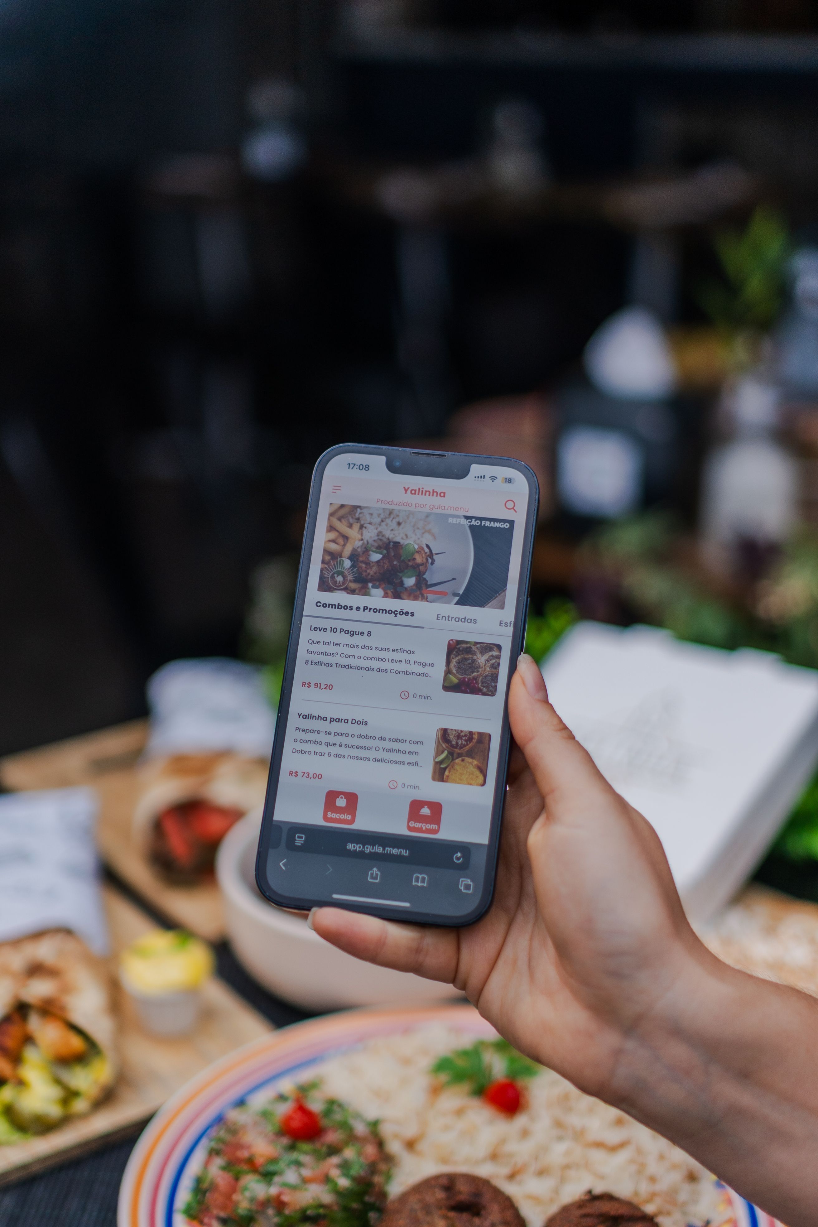
Menu categories such as Burgers, Sides, and Drinks should be easy to identify and navigate. Use meaningful headings and accessible links or buttons for their intended actions. If a category expands, expose its expanded or collapsed state and ensure keyboard users can operate it. When a category selection changes content, make the result easy to find; choose focus behavior that matches the interaction and test it with assistive technology.
Each item needs a meaningful name, description, price, and availability presented in a logical order. Images of food can be helpful, but essential information must not exist only in an image or color. If an item is unavailable, communicate that in text and through the control’s state where appropriate.
3. Test customization: the most fragile part of the journey
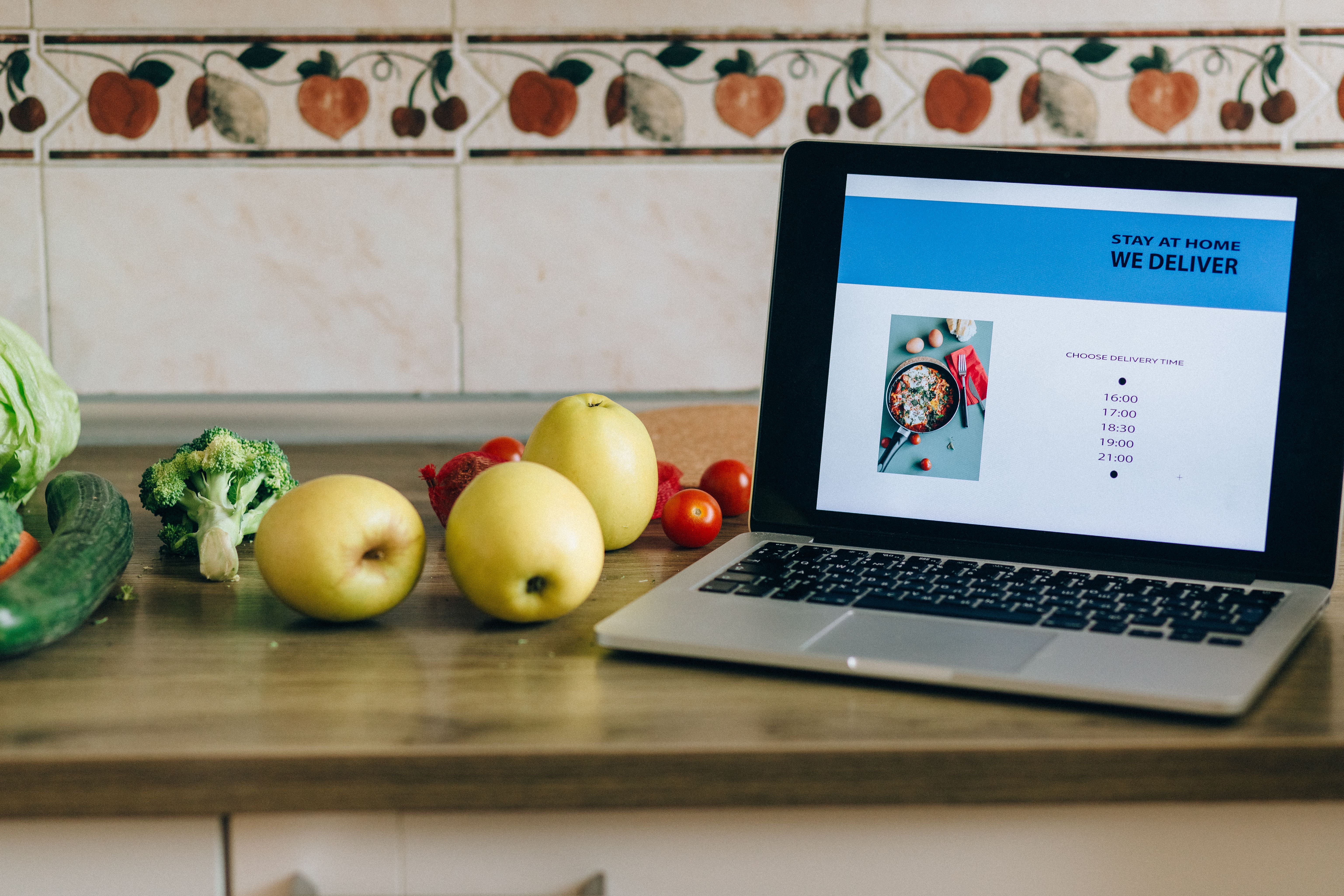
Imagine choosing a sandwich, selecting bread, removing cheese, and adding a side. A visual panel may make the choices obvious while a screen reader announces only “button” or fails to identify which option is selected. Group related choices under a clear label, identify required groups, and expose the name, role, and selected state of each control.
Native radio buttons and checkboxes are often suitable for single and multiple selections. If a custom widget is necessary, implement its expected keyboard behavior and test it with screen readers. Communicate extra charges, required selections, and changes to the total in a way customers can perceive before adding the item.
For a modal customization dialog, move focus into the dialog when it opens, keep keyboard navigation within it while it is open, and normally return focus to the triggering control when it closes. Provide a clearly named close control and support expected keyboard dismissal. The W3C modal dialog pattern describes the interaction in more detail; a nonmodal panel needs behavior appropriate to its own design.
4. Confirm that the item reached the cart
A customer activates “Add to order.” If only a cart icon changes visually, a screen reader user may not know whether the meal was added. Provide a concise, meaningful confirmation, such as “Veggie sandwich added to your order,” and make errors equally apparent. A status message can often be announced without moving keyboard focus; see WCAG 4.1.3: Status Messages.
If a cart drawer opens, determine whether it is modal or nonmodal and apply the appropriate focus and keyboard behavior. Give edit, remove, and quantity controls distinct names, such as “Remove veggie sandwich,” and verify that price and quantity changes are perceivable. An announcement is useful only if it accurately reflects the result.
5. Make pickup and delivery choices clear
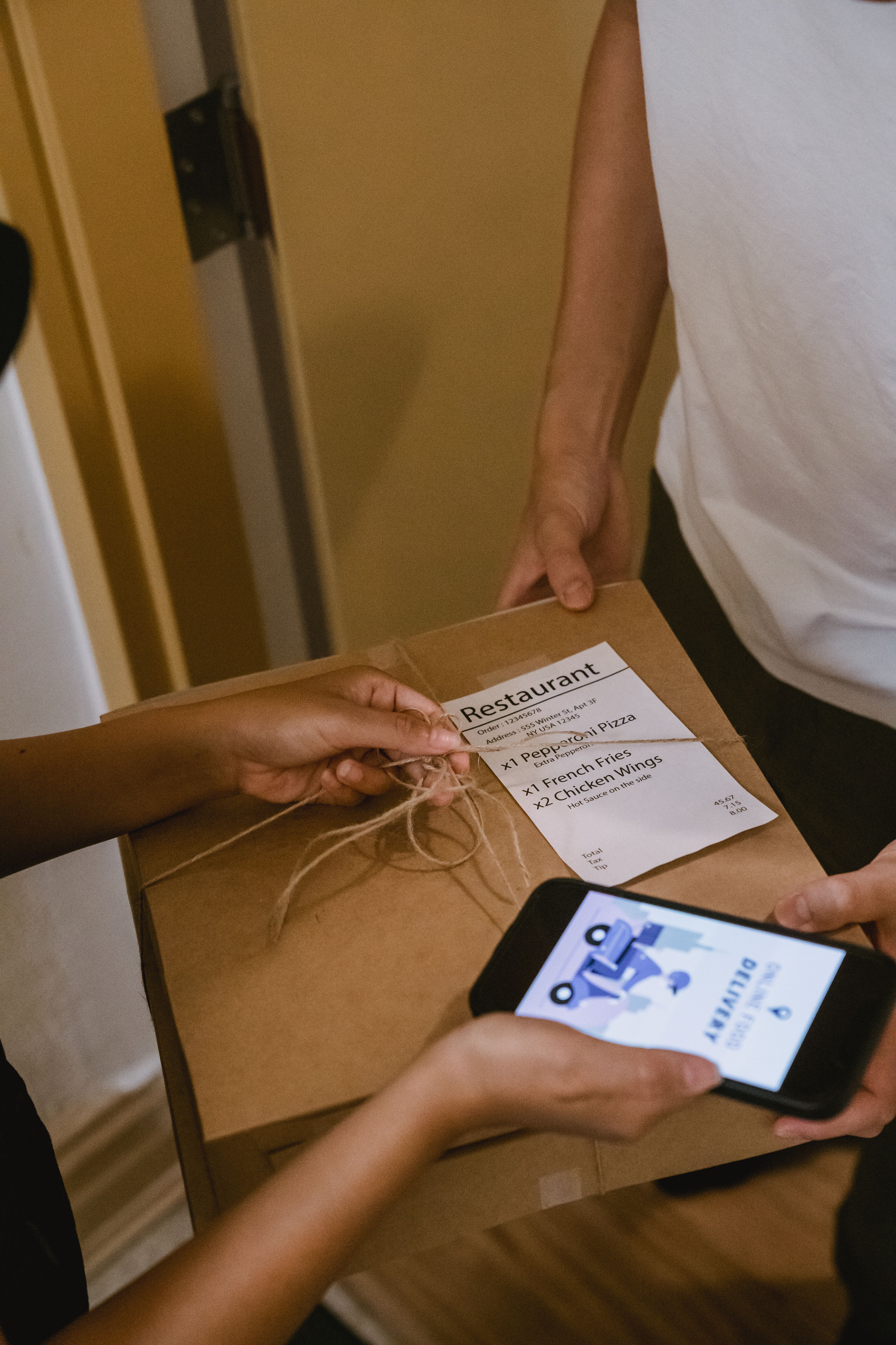
Pickup and delivery may change the restaurant, menu, fees, and available times. Ensure that customers can identify the current selection and understand when changing it will affect their order. Label date and time controls and communicate unavailable time slots clearly. Avoid relying only on color to show a selected or disabled time.
Delivery address suggestions can be especially difficult. Test whether users can reach suggestions, understand the highlighted option, select it with a keyboard, and correct the address when no suggestion is suitable. Verify the same journey on mobile with the screen reader and touch gestures used by customers.
6. Help customers recover from checkout errors
Required fields, payment details, telephone numbers, and delivery instructions should have persistent, programmatically associated labels. If a field fails validation, identify it and describe the problem in text. An error summary linked to the affected fields can help, as can moving focus to the summary when appropriate; the error should also remain associated with the field for later review.
Do not erase valid entries when one field needs correction. Explain how to resolve a problem where possible, and test discount codes, tipping, delivery fees, and payment controls. W3C’s error identification guidance explains why a visual red outline alone is insufficient when an error is detected.
7. Include the confirmation page and third-party tools

An accessible checkout still needs an understandable outcome. After submission, check that the customer can determine whether the order succeeded, review the order number, location, pickup or delivery time, and total, and find the next step. Test failed payments and retry paths too, without making duplicate live purchases during testing.
Many restaurants use an outside ordering provider or embedded widget. Include that component in the audit, even when a vendor operates it. Document the affected page, browser and assistive technology, steps, expected behavior, and actual result; share reproducible findings with the party able to fix them. The restaurant’s team and vendor should agree on ownership and retest after changes.
A practical restaurant ordering accessibility checklist
- Find a restaurant and start an order using only a keyboard.
- Navigate menu categories and identify item names, prices, and availability.
- Choose required and optional ingredients and confirm their selected states.
- Open and close customization dialogs without losing focus.
- Add an item, hear or otherwise perceive the result, and edit the cart.
- Select pickup or delivery, location, and an available time.
- Trigger and correct a checkout error without losing valid entries.
- Verify success, failure, and confirmation details on desktop and mobile.
- Repeat representative flows with screen readers and after fixes.
Combine automated checks with real interaction testing
Automated tools can flag certain detectable errors, but a passing scan cannot establish that someone can customize a meal or understand an order confirmation. Combine automated checks with keyboard-only testing and representative screen reader/browser combinations, such as NVDA with Chrome and VoiceOver with Safari. Include people with disabilities in usability testing where possible, and document versions and scope.
For more on testing techniques, read our screen reader testing guide and guide to form accessibility problems. Our website accessibility audit guide explains how to scope findings and retesting.
What about the ADA?
The U.S. Department of Justice explains that web accessibility barriers can prevent people with disabilities from accessing the goods and services businesses offer online. Read the DOJ’s guidance on web accessibility and the ADA. Legal obligations and remedies depend on the facts and applicable law; restaurants should consult qualified counsel for advice about their circumstances. WCAG is a technical standard, and no single checklist or automated tool guarantees legal compliance.
Want to understand where your ordering journey creates barriers? Contact ADA Access Group to discuss an accessibility assessment and retesting.
Featured photo: Mizuno K / Pexels.